
Introduction
The original release of LEGO Life App saw major drop off in the photo upload flow.
Experiment with bottom navigation radial menu.
Experiment with new LEGO Life bottom bar.
Live adjusted LEGO Life bottom bar.
While working on the LEGO Movie Maker digital experience, I often thought about how our project would best integrate into the LEGO Life experience. Talking with the LEGO Life team, I also learned about some struggles with user drop-off, especially around photo uploading.
The Challenge
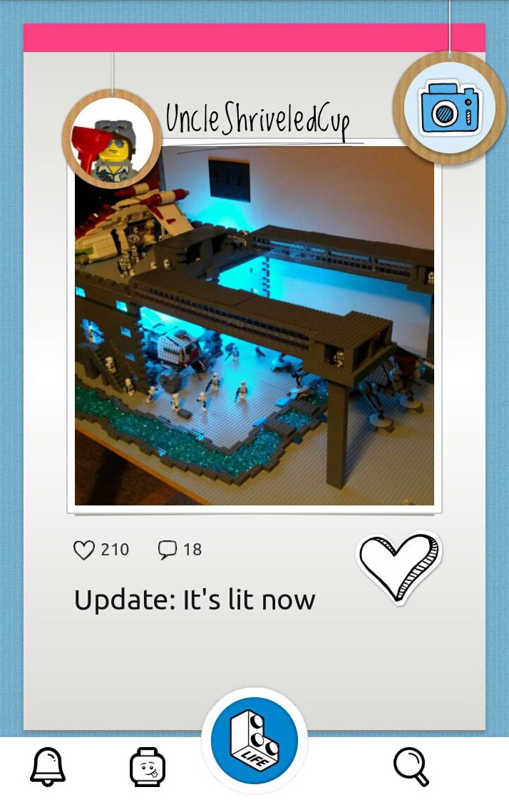
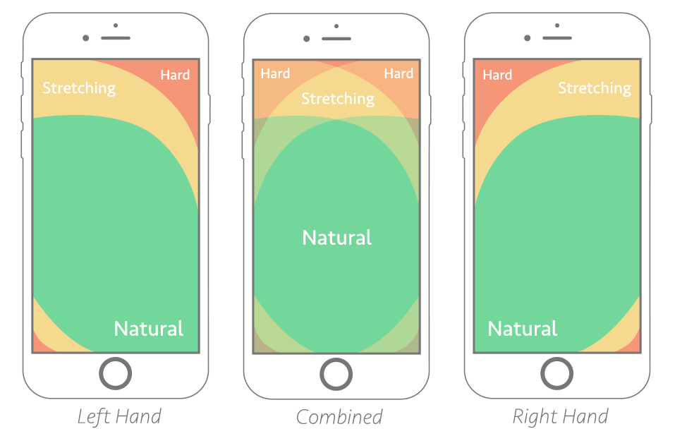
The original UX and UI of LEGO Life (Left Image) had photo uploading happening from the top right corner with a button that was not integrated into the main navigation in the bottom bar. The button also did not visually blend with the rest of the navigation UI with which the children were being presented. On top of all this, we know that 8-11-year-olds' hands are much smaller than adults. With mapping touch points of adults, this button would still be a stretch for most users.
Process
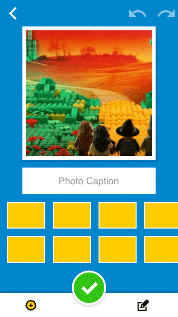
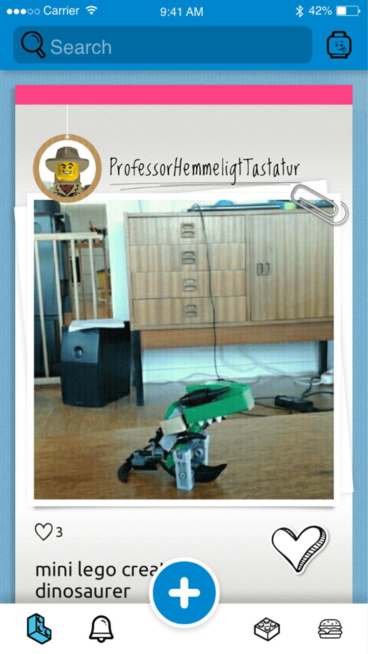
In my exploration, having a centralized action button that would drive the LEGO Movie Maker experience would be the best way to create content prices or decide how to share (Second image). I decided to create a quick prototype of the same functionality in the LEGO Life app to share with their Design Team (Snippet shown in the third image).
My proposal to them was to say that the purpose of LEGO Life is that we want kids to go there and 'add' 'things' to their LEGO Life. This could be images, movies, or registering the products they just got as gifts. If they have a central place to do this, they know what LEGO life is for, and placing it in an easy-to-reach place for kids will decrease the drop-off.
Conclusion
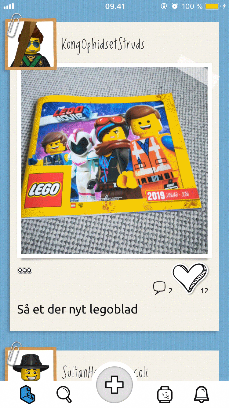
While some of the main ideas didn't make it into the final Movie Maker app, the LEGO Life team liked some of the changes I presented around the main functionality. They implemented the '+' button in the center and did a great job on the final UI and motion design (Fourth image). Even after the initial change, there has been a UI overhaul of the app, which is still the bottom bar setup. And I know that this has decreased photo-upload drop-off and increased overall performance and understanding of the app.


